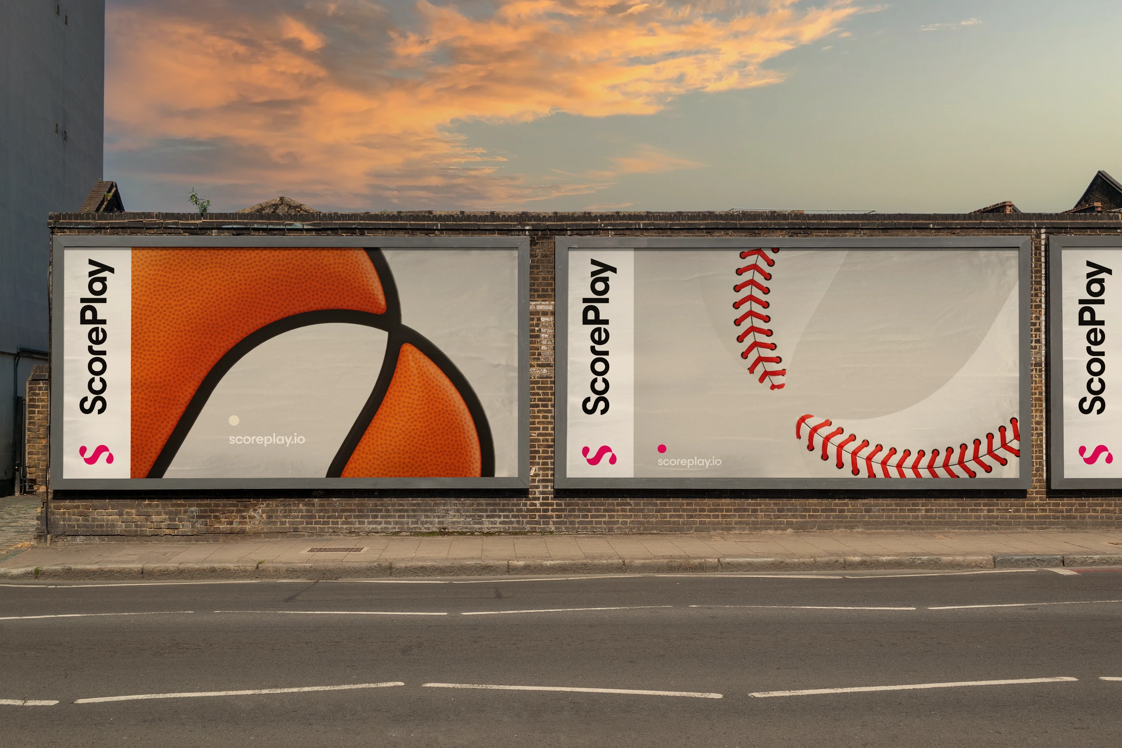
For the past 10 months, we have been working on our new brand, and we're so excited to share it with you.
Welcome to the next chapter in our story. At ScorePlay, we believe in the power of transformation — not just for ourselves but for the entire sports industry. ScorePlay empowers rights-holders to tell stories with optimized and automated content indexation, management and distribution, so photos and videos are immediately searchable by internal teams, and accessible by the most important ambassadors such as athletes and partners. Our rebranding is not just a change of visuals; it's a reimagination of our purpose and promise to our users. Here’s a deeper look at our new identity and what it signifies.
Why We Chose to Rebrand
Rebranding ScorePlay was a decision driven by our commitment to stay ahead of the curve and deeply align with the evolving needs of sports organizations, fans, and the narratives that connect them. This strategic shift emphasizes our innovation, agility, and the human element in sports technology, ensuring we continue to offer relevant and impactful solutions, and the service that has made us who we are. Our rebranding effort underscores our commitment to empowering sports organizations with the management and monetization of their media content, which are becoming more and more vital as the fragmentation of sports content continues to take hold across channels, formats, and geographies. Read more on why ScorePlay decided to rebrand directly from the CEO and Head of Marketing.
“The decision to rebrand was not taken lightly. It had to be more than a new look. It needed to reflect how we had grown, our identity in the industry, the employees behind the project, and the customers and users that have made us who we are today. It’s been an incredibly exciting project to be part of, and we’re so excited to share it with the public.” Rafael Molina Harno, Head of Marketing at ScorePlay.
Most importantly though, a brand is more just a logo. A strong brand is reflected in your product, your team, how you make your users feel, and the first words that come out of someone’s mouth when they mention your name. We strived to make that a reality and have our visual brand reflect how people perceived ScorePlay already.
A Logo That Tells Our Story
Our new logo is a testament to fluidity and integration. The design, featuring two interconnected terminals, symbolizes the journey from league to athlete, or ScorePlay to client - a visual representation of the workflows we craft every day. It’s not just an ‘S’; it’s a representation of our seamless workflow solutions that are easy to use and implement. This transformation adds a new dimension to our identity, embodying both motion and connection — core aspects of both sports and our services. The sleek and modern design illustrates our metamorphosis and reflects our evolved value proposition and cutting-edge media infrastructure offering.

The Power of Fuchsia: Our New Color Palette
Choosing fuchsia as our primary color was a bold move, intended to make us stand out in the crowded sports media landscape. This color does not follow trends of the moment (such a blue and purple hues, or more flashy fluo colors) — it sets them. It’s designed to be timeless, adaptable across various sports and teams, and to signify our confidence and uniqueness in the market. Fuchsia is our statement of creativity and independence, offering a pop of personality while maintaining elegance and professionalism. The expanded color palette plays with warmer colors to express our commitment to building tools that are not just useful, but satisfying to the humans behind the screens.
Moreover, our choice of fuchsia reflects our dedication to innovation and pushing the boundaries in the industry. It symbolizes our efforts in building new workflows, integrating cutting-edge AI technologies, and exploring new monetization channels. By embracing fuchsia, we highlight our role as pioneers, continuously striving to redefine the standards and create future-oriented solutions in the sports media landscape.

Typeface: Clarity Meets Beauty
Our new typeface balances clarity with character. It's designed for easy readability across digital and print formats, ensuring that our message is always clear and engaging. The simplicity of the design not only appeals aesthetically but also aligns with our brand’s straightforward, user-focused approach to technology.
Looking Forward
As part of the company’s next phase of growth, ScorePlay is offering 3 tiered solutions to sports organizations worldwide: Creator (DAM), Studio (MAM) and Pulse (Enterprise MAM). These solutions help all entities operating within the sports ecosystem adapt more quickly to the shifting landscape of sports content by allowing each organization tell the stories they want, and grow their brand and revenue.
“Since we were founded, we’ve always worked to redefine how sports organizations tell stories. This year, it was time to redefine how we tell ours.” Victorien Tixier, CEO & Co-founder of ScorePlay
Our rebranding is just the beginning. With this new identity, we are even more ready than ever to tackle the challenges of today and seize the opportunities of tomorrow. Our mission is to equip our clients with the essential tools to efficiently manage and monetize their media content. We promise to keep pushing the boundaries of what sports media technology can achieve, ensuring our partners and clients always have the best tools at their disposal. We are committed to developing the ultimate media infrastructure, continually adapting to the intricate needs of large organizations as fan preferences evolve, and enhancing the monetization aspect of our product.
We invite you to explore our new website, connect with our stories, and join us as we continue to innovate and inspire in the world of sports. Let’s craft new narratives together.


